Being based in the UK, it is hard to understand exactly how the US and UK differ when it comes to social media initiatives, and the embedding of social media into everyday marketing and advertising.
Over the last week, I have been fortunate enough to be in both Seattle and San Francisco to see how social media compares in the US with the UK.
The best indication of the status of social media adoption by a country or region in my mind is how prominent the use of social networks in any call to action.
Shown below are two typical examples from San Francisco.
In the first, a huge (1 story high) digital sign in the Westfield San Francisco Centre proudly displays their social media properties (including foursquare). In each case you can click the picture for a better view.
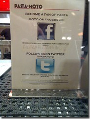
The picture below was snapped on the counter of a pasta shop in the food court in the same centre.
If we use the social media call to action metric also for London, we see that the UK is not that far behind (if at all).
Below is a London underground poster promoting Queen the Musical, complete with the Facebook and Twitter logos. Where the UK and US do differ in this regard is in the US they put the actual Facebook/Twitter/Foursquare name (knowing it may be difficult to guess it).
In the example below, you would still have to guess/search for the production. Perhaps an extra line of copy with the Facebook/Twitter address would help discovery.
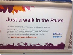
Royal Parks also has the Facebook and Twitter logos (but no address) to promote their half marathon.
National Rail has been printing al of their tickets lately with the Twitter logo and @nationalrailenq twitter address – 10 marks out of 10!
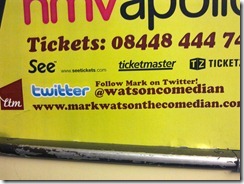
Finally, another London tube poster, this time advertising comedian Mark Watson – with his full Twitter address @watsoncomedian
So, in summary the UK does not seem to be too far behind when it comes to using social media as a call to action, however, just putting a Foursquare or Twitter logo is not enough.
You need to make it easy to find the relevant Facebook page or Twitter handle. It is a bit like putting a picture of the globe and saying “we’re on the www” without putting the web address.
The US examples above have the Facebook, Twitter, and in Westfield’s case Foursquare address clearly visible.
Make it easy to like and follow and consumers will. Make them work for their loyalty and they may just go somewhere else.


